Apple divides UI components into 8 major functional groups. This wiki is a lookup table for "I need to do X, which component should I use / when should I avoid this component". For each component it provides:A one-sentence definition + when to use it + key do/don't guidance + cross-platform support.
For easily confused component pairs (pop-up buttons vs pull-down buttons, lists vs collections, alerts vs action sheets, sheets vs popovers…), I have marked "how to choose" guidance.
mindmap
  root((63 组件 / 8 组))
    菜单与操作
      按钮 / 弹出 / 下拉
      菜单 / 上下文菜单
      工具栏 / 活动视图
    选择与输入
      文本框 / 选择器
      滑块 / 步进器 / 开关
      分段控制 / 键盘
    界面展示
      警告 / 操作表
      Sheet / Popover / 面板
      窗口 / 滚动 / 页面控制
    布局与组织
      列表表格 / 集合 / 大纲
      分栏 / 标签视图 / 框
    导航与搜索
      标签栏 / 侧边栏
      搜索栏 / 路径 / 标记
    内容承载
      图表 / 图像 / 文本 / 网页
    状态指示
      进度 / 活动环 / 仪表 / 评分
    系统体验
      小组件 / Live Activities
      通知 / 控件 / 复杂功能
      快捷方式 / 菜单栏 / 表盘
1. Menus and Actions
Buttons — Initiate an immediate action. They have three attributes:Style(size/color/shape),Content(icon/text/both),Role(Normal/Primary default action/Cancel/Destructive).
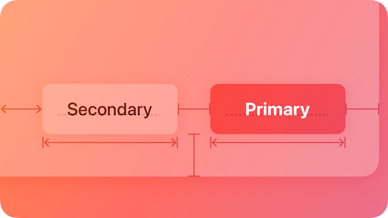 Figure: Use style rather than size to distinguish preferred actions — Secondary on the left (light fill), Primary on the right (solid fill), identical size. Use the same size for a group of similar options, and rely on a more prominent style to mark "the most likely choice".
· Tap target ≥44×44pt (60×60pt on visionOS); limit the number of "visually prominent buttons" in each view (too many increases cognitive load); use verb phrases for button text ("Add to Cart"). macOS has dedicated button types for push/gradient/help/image and more; visionOS buttons have a visible background + sound feedback (no haptics), with 3 shapes (circle/capsule/rounded rectangle) × 5 sizes; watchOS 10 uses all capsule shapes, with full-width buttons for primary actions.
| Component |
One-sentence summary + when to use |
Key do/don't |
Not supported |
| Pop-up Buttons |
Select mutually exclusive options; the button displays the current value after selection |
Provide a useful default value; use when space is limited |
— |
| Pull-down Buttons |
List actions/commands(related to the button's function) |
Worth using only for ≥3 items; do not hide the primary action inside; mark destructive actions in red and require confirmation |
tvOS/watchOS |
| How to choose: Pop-up vs Pull-down |
Selecting a value → Pop-up; selecting an action → Pull-down |
Use pull-down also when multi-select/submenus are needed |
— |
| Menus |
List commands/options to save space |
Place frequently used items at the top; use logical grouping + dividers; submenus ≤1 level deep and ≤5 items; use dynamic labels for toggle items ("Show/Hide Map") |
— |
| Context Menus |
Reveal commands related to the current item on long press/right-click |
Include only the most relevant items (do not use as an entry point to "discover all features"); hide unavailable items instead of graying them out; place destructive items at the end and mark them red; choose either this or the edit menu, not both |
— |
| Edit Menus |
Copy/translate/look up and similar actions for selected content |
Prioritize the system menu; show only currently available commands; support copying noneditable text |
tvOS/watchOS |
| Toolbars |
Frequently used commands for the current view |
Do not include too many items; iPadOS/macOS/visionOS support grouping + customization; automatically become translucent when content is below;Toolbars = actions, tab bars = navigation; do not show both at the same time |
— |
| Activity Views (Share Sheets) |
Tasks such as share/copy/print |
Do not duplicate existing actions; use verb titles for custom actions; trigger with the share button |
macOS (use extensions instead) |
| Ornaments |
Floating control bars along the edge of visionOS windows |
Keep them steadily visible; width ≤ the window; use borderless buttons (glass background) |
visionOS only |
| Dock Menus |
Right-click menus for macOS icons |
Include high-value items (recent windows/frequently used actions); ensure they are also accessible elsewhere |
macOS only |
| Component |
One-sentence summary + when to use |
Key do/don't |
Platform |
| Text Fields |
Input a small amount of text (name/email) |
Use placeholders to demonstrate format; use secure text fields for passwords; show the keyboard appropriate to the content type; validate at appropriate times |
All platforms |
| Text Views |
Multi-line/editable/styled long text |
Use labels for short text; use text fields for short editable text |
All platforms |
| Pickers |
Medium to long lists of options (date/time/region) |
Use pull-down buttons for short lists; use lists for very large sets; use predictable sort order; minutes can be set at 15-minute intervals |
All platforms |
| Segmented Controls |
2+ mutually exclusive (or multi-select) closely related options |
iPhone ≤5 segments, widescreen ≤5–7 segments; do not place in toolbars; place view-switching controls in the navigation bar |
All platforms |
| Sliders |
Adjust continuous values |
Keep direction consistent (left/bottom = minimum); do not use to adjust volume (use dedicated volume controls); pair with a text field + stepper for large ranges |
tvOS not supported |
| Steppers |
Increase or decrease a value by small increments (does not display the value itself) |
Pair with an adjacent field to show the value; pair with a text field for large ranges |
watchOS/tvOS not supported |
| Toggles |
Two-state switching (on/off) |
Do not rely on color alone to show state differences; use Switch in iOS list rows, button-style toggles in other scenarios; macOS has Switch/Checkbox/Radio |
All platforms |
| Color Wells |
Adjust color, opens the color picker on tap |
Prioritize the system color picker (can save frequently used colors) |
tvOS/watchOS not supported |
| Image Wells |
Editable image views (drag and drop to replace) |
Support copy and paste; restore the default image when cleared if the field is required |
macOS only |
| Combo Boxes |
Text field + drop-down (can type or select) |
Fill in a meaningful default value; use guiding labels; list items should not exceed the box width |
macOS only |
| Digit Entry Views |
Full-screen PIN/password entry (TV) |
Use secure fields (● replacement); use a title to explain the purpose |
tvOS only |
| Virtual Keyboards |
Input when no physical keyboard is available |
Select the keyboard type by semantics; the Return key can be changed to "Search/Send"; custom keyboards should not duplicate system functionality |
— |
3. Presentation
This group is the easiest to choose incorrectly; the core is increasing "level of interruption": Popover < Sheet < Action Sheet < Alert (most interruptive).
| Component |
One-sentence summary + when to use |
Key do/don't |
Platform |
| Alerts |
Critical information that must be known immediately / destructive action confirmation |
Use sparingly(interrupts tasks); do not use alerts for purely informational messages; do not pop up for common reversible actions; maximum 3 buttons; do not use "OK" as the default (use specific words such as "Delete") |
All platforms |
| Action Sheets |
Multiple options for an action initiated by the user multiple selection options |
Use this instead of a menu (confirms after the action); place destructive items at the top, mark them red, and include a Cancel button; do not make them scrollable (iOS) |
visionOS not supported |
| Alert vs Action Sheet |
Informing about a problem/requesting confirmation → Alert; providing action options → Action Sheet |
Alerts are unexpected; action sheets are actively triggered by the user |
— |
| Sheets |
Modal tasks closely related to the current context |
Use Sheets for simple tasks; use full-screen or a new window for complex/long tasks; only one at a time; iOS supports nonmodal + medium/large detents + drag indicator |
All platforms |
| Popovers |
Small amounts of information/simple actions, with an arrow pointing to the triggering element |
Use a Sheet instead in compact views (iPhone portrait); only one at a time, do not cascade; do not use to show alerts |
tvOS/watchOS not supported |
| Sheet vs Popover |
Temporary small content → Popover (widescreen); independent task → Sheet |
Always use Sheet on compact screens |
— |
| Panels |
Auxiliary controls/inspectors that float above windows on macOS |
Use for simple adjustment controls; use short titles; hide when the app resigns active state; HUD style is for media scenarios only |
macOS only |
| Windows |
Content containers on iPadOS/macOS/visionOS |
Adapt to size; do not use custom border buttons; refer to them as "windows" not "scenes" in UI; visionOS defaults to 1280×720pt, viewed at 2 meters |
Not available on iOS/watchOS |
| Scroll Views |
Scrollable content that exceeds bounds |
Use familiar elastic behavior; hint that content is scrollable (show half an item); do not nest same-direction scrolling; one per screen (iOS) |
All platforms |
| Page Controls |
A row of dots indicating linear page position |
Place centered at the bottom; ≤10 dots; custom symbols must be simple; do not customize colors |
All platforms |
4. Layout and Organization
| Component |
One-sentence summary + when to use |
Key do/don't |
Platform |
| Lists and Tables |
Row-based data (can be grouped/hierarchical/editable) |
Use this first for text content; use collections for many images/large size differences; give feedback on selection; use noun phrases for column headers |
All platforms |
| Collections |
Highly visual ordered content (image-focused) |
Use standard row/grid layouts; do not create confusing custom layouts; leave margins around images for easier selection |
All platforms |
| List vs Collection |
Text → List; images → Collection |
— |
— |
| Outline Views |
Hierarchical data in a scrolling list (disclosure triangles) |
Use tables for non-hierarchical data; place hierarchy in the first column; support column header sorting + width adjustment; preserve disclosure state |
Primarily macOS |
| Split Views |
Adjacent multiple panels (primary selection → secondary shows details) |
Keep the current selection persistently highlighted; support drag and drop; not recommended for iPhone portrait; iPad supports two/three columns |
Use cautiously on iOS compact |
| Tab Views |
Switch between mutually exclusive content panels in the same area |
Controls affect only the current panel; ≤6 tabs; do not use pop-up buttons to switch tabs |
— |
| Sidebars |
Leading-edge navigation between areas (floats over content) |
≤2 levels of hierarchy (use split views for deeper levels); do not hide by default; not recommended on iOS (use tab bars); iPadOS can adaptively switch to tab bars |
Not recommended on iOS |
| Boxes |
Visually group logically related content |
Do not make them too large (loses effect when close to window size); do not nest multiple boxes (use margins/alignment for subgroups); use short titles |
— |
| Labels |
Static, readable, noneditable text |
Use this for small amounts of noneditable text; use text fields for editable text; make useful information (IP addresses/error codes) selectable and copyable |
— |
| Column Views |
Browse deep hierarchies in vertical columns (browser-style) |
Use when hierarchies are deep + users frequently switch back and forth; place the root in the first column; do not provide sorting |
Primarily macOS |
| Lockups |
Combine multiple views into interactive units (cards/posters) |
Leave sufficient spacing (focus magnification); keep sizes consistent within a row; 4 types: card/caption button/letter icon/poster |
Primarily tvOS |
| Disclosure Controls |
Show or hide related information on demand (triangle/button) |
Keep frequently used items visible at the top, hide advanced items by default; use descriptive labels; only one disclosure button per view |
— |
5. Navigation and Search
| Component |
One-sentence summary + when to use |
Key do/don't |
Platform |
| Tab Bars |
Top-level functional area navigation |
Navigation only, no actions(use toolbars for actions); keep visible; avoid a "More" tab; use single-word titles; use badges for alerts |
— |
| Search Fields |
Type terms to find results |
Placeholder indicates content type ("Shows, Movies"); instant search + suggestions; scope controls + token filtering; recommended to place at the bottom on iOS |
— |
| Path Controls |
Displays file path hierarchy |
Place in the main window body, not the toolbar |
macOS only |
| Token fields |
Converts text into actionable tokens (e.g., email recipients) |
Provide context menus for tokens; support multiple conversion triggers (comma/return) |
macOS only |
| (For sidebars, see "Layout and Organization") |
|
|
|
6. Content Containers
| Component |
One-sentence description + when to use |
Key do/don't |
Platform |
| Charts |
Data visualization (bars/lines/point markers) |
Bars = compare categories, lines = show change over time, points = show anomalies/relationships; do not rely on color alone (pair with shapes);Audio graphs + accessibility labels(Describe meaning, not color); do not require interaction to view key information |
— |
| Image views |
Displays a single image or image sequence (usually non-interactive) |
Wrap in a button if interaction is needed; use SF Symbols for icons instead of image views; do not overlay text on images |
— |
| Text views |
(See "Selection and Input") |
|
— |
| Web views |
Loads web pages/HTML within the app |
Provide forward and back navigation for multi-page content; do not use as a browser (that is what Safari is for) |
— |
7. Status Indicators
| Component |
One-sentence description + when to use |
Key do/don't |
Platform |
| Progress indicators |
Indicates loading/time-consuming operations are not frozen |
Use determinate style when progress is quantifiable; avoid patterns like "jumping to 90% in 5 seconds then stalling for 5 minutes"; maintain animation; do not switch between circular and linear styles; provide a cancel option for interruptible tasks |
All platforms |
| Activity rings |
Progress for Move/Exercise/Stand three goals |
Use only for these three goals, use the standard black-background style, do not change colors or add effects, do not use for brand decoration; single-user only |
iOS/watchOS only |
| Gauges |
Displays the current value within a numeric range (circular/linear) |
Use gradient fills to convey purpose; use color to indicate important intervals; single-user only; macOS provides Level Indicator |
Not supported on tvOS |
| Rating indicators |
A row of symbols representing a rating (stars by default) |
Display only complete symbols (round to nearest whole); allow direct editing within lists; custom symbols must have clear meaning |
macOS only |
VIII. System Experiences (system-level components that go beyond a single app)
| Component |
One-sentence description + when to use |
Key do/don't |
Platform |
| Widgets |
Glanceable timely information on the Home Screen/Lock Screen/Desktop |
Clear core concept; update dynamically (do not treat as just an icon); text ≥11pt and use system fonts; do not rasterize text (VoiceOver cannot read it); support Dark/Tint/StandBy/Night modes |
iOS/iPadOS/macOS/watchOS |
| Live Activities |
Real-time progress on the Lock Screen/Dynamic Island (≤8h) |
Clear start and end; end upon completion (removed after 15–30 minutes); display only key information; do not include advertising; use a distinct layout (do not imitate notifications) |
iOS/iPadOS/watchOS |
| Notifications |
Timely, valuable status updates |
Request permission first; use alerts for errors instead of notifications; use verbs for action buttons (do not just say "Open App"); badges only show unread count |
iOS/iPadOS/macOS/tvOS/visionOS |
| Controls |
Quick functions in Control Center/Lock Screen/Action button |
High-value functions usable without launching the app; provide two symbols for on/off toggles; hide sensitive information on the Lock Screen; require verification for secure operations |
iOS/iPadOS only |
| Complications |
Glanceable real-time information on the watch face |
Use WidgetKit; support all families; deep link to relevant pages; ensure legibility in tinted mode; line width ≥2px |
watchOS only |
| App Shortcuts |
Common tasks invoked via Siri/Spotlight |
≤10 shortcuts; include the app name in the title; parameters should be predictable; provide around 5 options for confirmation when ambiguous |
Not supported on macOS (actions are available) |
| Quick Actions |
Shortcut menu accessed by long-pressing the app icon |
≤4 high-value actions; concise titles without the app name; do not use emoji (use monochrome SF Symbols) |
iOS/iPadOS only |
| Menu bar |
Main command entry point at the top of Mac/iPad |
Follow the standard order (App/File/Edit/Format/View/Window/Help); show all items (gray out unavailable ones); use standard keyboard shortcuts; use single-word titles |
macOS/iPadOS only |
| Status bars |
Device status at the top of the screen (time/battery level) |
Ensure readability (navigation bar/blurred background); temporarily hide during full-screen media; do not hide permanently |
iOS/iPadOS only |
| Top Shelf |
Content display area on the Apple TV Home Screen |
Help users quickly access content; showcase new content (do not promote already viewed content); dynamic content is better than static; do not display advertising/pricing |
tvOS only |
| Watch faces |
Core watchOS interface |
Promote the app + complications via shared watch faces; provide previews; handle model incompatibility (offer alternative configurations) |
watchOS only |
Derived from the Components manual (8 groups, 63 articles). For interaction flows (onboarding/search/feedback, etc.), see Apple HIG Interaction Patterns (25 flow patterns · Onboarding/Input/Feedback/Media/System Collaboration); for visual foundations, see Apple HIG Visual Foundations (Color/Typography/Layout/Materials/Motion/Dark Mode/Icons/SF Symbols/Branding). For in-depth iOS design guidance on Live Activities/Widgets, see also Apple HIG iOS In-Depth Design for Live Activities/Widgets (platform differences/cursor/navigation/copywriting/charts/windows/subscriptions/dynamic components).
Sources and related materials
