
Apple’s biggest visual language update starting in iOS 26. Highly time-sensitive (released in 2025), covered in a separate article. The dynamic effects of Liquid Glass are essentially video demonstrations(the original document contains a large number of
.mov, viewable locally in Obsidian, not committed to git); this wiki explains the concepts thoroughly.
1. What Liquid Glass Is
It does not imitate any real-world material, but is an entirely new digital "meta-material": it refracts and shapes light in real time to create depth and layering; it is as light and flexible as liquid (responding instantly to a finger touch), and has gel-like softness (moving synchronously and deforming slightly during interaction).
· Evolution path: macOS X Aqua (skeuomorphic transparency) → iOS 7 real-time blur → iPhone X fluidity → Dynamic Island morphing → visionOS immersion → Liquid Glass(the culmination of all prior work). It aligns with the trend of increasingly rounded screens, fitting into device rounded corners with rounded, floating forms. · Core visual mechanism = Lensing effect: like a lens, it bends light to create a sense of depth (unlike traditional scattering blur), letting you clearly see both the controls in front and the content behind. Expand/collapse uses smooth water-wave transitions. · Calm at rest, activated in motion: when stationary, the interface is clean and quiet; when touched, it "activates" — glowing from within and bouncing like water, full of "vitality".
2. Material Layer Structure (built into the system, applied automatically when used)
graph TD
  E["Liquid Glass 材质(多层协同)"] --> H["高光层 Highlights<br/>模拟真实光照,随形状/设备倾斜而动"]
  E --> S["阴影层 Shadows<br/>给'落地感';压文字上自动加深、压浅色上变浅"]
  E --> F["内部发光反馈 Feedback Illumination<br/>从手指触点扩散,蔓延到附近元素"]
  E --> T["聚焦变化 Focus Transition<br/>切窗口时变暗/退后,聚焦当前"]
All of these are system-provided behaviors that you get automatically when you use Liquid Glass; you do not need to implement them yourself.
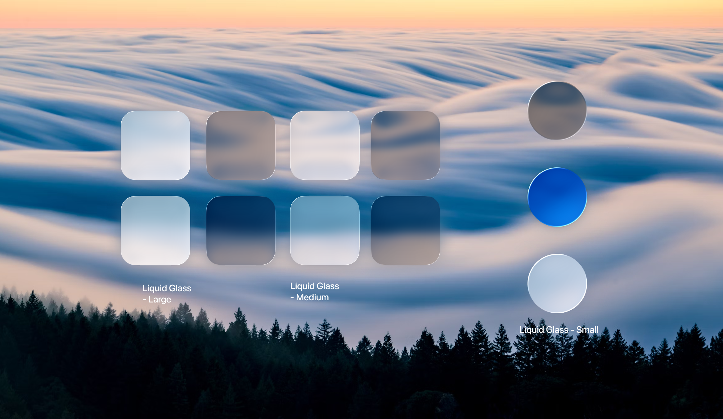 Image: Real samples of Liquid Glass in Large / Medium / Small three sizes (from iPadOS 26 UI Kit). The same material changes thickness with size — large panels are more opaque to preserve readability, small controls are more transparent to show the background through; the right column circles show tinted (blue) and monochrome states. When the background changes (brightness of the sea of clouds), the lensing refraction and light/dark of the glass change accordingly.
3. Two Variants (do not mix)
| Variant | Characteristics | When to use |
|---|---|---|
| Regular(most commonly used) | Includes all visual and adaptive features, maintains readability at any size/background | Choose this by default; other elements can be placed on top |
| Clear | No adaptivity, always highly transparent, lets the underlying layer "show through" | Only when all 3 conditions are met: ① Rich multimedia background (image/video) ② A darkening layer is added (content remains perceptible after dimming) ③ Content above is prominent (white icons/large text) |
Hard rule: avoid glass-on-glass — do not stack multiple Liquid Glass elements (it quickly looks crowded and loses hierarchy); use semi-transparent color blocks instead. Liquid Glass is only used for navigation layers that float above content(toolbars/tab bars); content layers (such as tables) keep ordinary materials, otherwise they will steal focus.
4. Adaptivity + Legibility
· Small controls(navigation bars/tab bars): switch between light and dark appearances along with the background (like smart glasses adjusting brightness with light); symbols/graphics on the glass switch synchronously to maintain maximum contrast. · Large panels(menus/sidebars): also adaptive, but do not switch between light and dark(frequent color changes over large areas cause dizziness), only the edges gradually turn gray; when enlarged they appear to "thicken" — deeper shadows, more obvious lensing refraction. · Scroll Edge effect(functional, not decorative): when content scrolls under the glass, it "dissolves" the content into the background to make the glass appear to float. Two styles:Soft blur(default, iOS/iPadOS floating buttons) / Hard blur(macOS dense interfaces, fixed table headers);do not mix or stack them, use one style per view.
5. Tinting + Accessibility
· Tinting is only used for primary actions that need emphasis(such as a red "View Bag" button in a food delivery app); after you pick a color, the system automatically generates the hue based on underlying brightness, like stained glass adjusting slightly with the background.Do not tint every element(it loses hierarchy); if you want to inject color into the interface, do so in the content layer(background images/illustrations) rather than the control layer. Solid filled buttons look stiff and abrupt; tinted ones are transparent and fit the environment. · Accessibility responds automatically(no extra code needed): reduce transparency → more frosted matte covering more background; increase contrast → black-and-white primary colors plus contrasting borders; reduce motion → turn off elastic animations.
6. Geometry and Concentricity
Make corner radii, sizes, and proportions consistent with device bezels, so shapes can nest inside one another.Three shapes: ① Fixed shape (constant corner radius, for high-density small controls on Mac) ② Capsule (corner radius = half the height, best suited for concentricity, sliders/buttons/tables; on desktop only for the most important buttons) ③ Concentric shape (corner radius = parent container corner radius − margin). Avoid pinched or flared corners (they cause visual tension); if images in cards are misaligned, switching to the concentric corner radius system fixes it automatically.Continuity: when moving across devices or resizing windows, users are "continuing a task" not starting over; one decision applies across all platforms; shared content uses the same icons to keep semantics consistent.
7. Icon Composer Icon Workflow (new 2025 tool)
From a single artwork → responsive dynamic icons for all platforms, supporting 6 appearance modes (default/dark/light transparent/dark transparent/light tint/dark tint).
· Workflow: Layer in design tools (only one background layer, multiple foreground layers, layered by Z-axis and by color for maximum control) → export SVG (flat graphics, preserve canvas size, number by Z-axis, convert text to outlines; layers containing gradients/photos export as PNG) → import into Icon Composer to adjust glass material/blur/shadow/transparency → save
.iconand drag into Xcode. · Canvas: Unified 1024px rounded rectangle for iPhone/iPad/Mac; 1088px for Apple Watch (slightly larger, circular).Do not add borders yourself(the system crops);reduce static effects in artwork(shadows/bevels), as the material’s built-in dynamic light and shadow will conflict; use rounded corners to let light flow naturally; light-to-dark gradient backgrounds pair best with lighting. · For dark mode, actively adjust colors (the brown tag on the dictionary icon is hard to see on dark backgrounds); for monochrome mode, set the most prominent part to white.
8. SF Symbols (system symbol library)
Symbols are the simplest cross-language communication method(everyone worldwide understands a triangle = play), improving recognition speed and expressing abstract concepts. SF Symbols correspond one-to-one with SF fonts (9 weights + 3 scales Small/Medium/Large) and automatically align with text.
▸ 4 rendering modes
| Mode | What it is | Where to use it |
|---|---|---|
| Monochrome | Single color | Most neutral, clearest at small sizes |
| Hierarchical | Monochrome + transparency layering | Create visual hierarchy (rain/cloud/sun in three levels); keeps color values consistent |
| Palette | 2+ colors each independently controllable | Highlight diversity, integrate into colorful interfaces |
| Multicolor | Inherent symbol colors (green for leaves) | Express real-world corresponding colors/meanings (add = green, delete = red) |
Layering logic: use primary/secondary levels when graphics have gaps, use primary/tertiary levels when they overlap and touch.Variable Color: changes by value based on opacity (WiFi signal strength), two modes: cumulative vs stepwise; choose either variable color or variable drawing, not both.
▸ Animations(use purposefully, do not overuse)
| Animation | Expresses |
|---|---|
| Appear/Disappear | Add/remove |
| Bounce | An action has happened/needs to happen (reaches maximum brightness) |
| Scale | Selection focus feedback (hovered folder enlarges);Bounce = action occurred, Scale = selection feedback |
| Pulse | Ongoing (changes opacity, screen sharing) |
| Breathe | Activity in progress (changes opacity + size, voice recording);Breathe feels more "alive" than Pulse |
| Wiggle | Call to action/emphasize change (paper airplane at 315°) |
| Rotate | Task in progress |
| Replace / Magic Replace | Function change; Magic Replace intelligently recognizes shared outlines for seamless transitions (play ↔ pause), falls back to standard animation when unrelated |
| Draw On/Off | "Draws/erases" along a path (wind left to right, Arabic letters right to left); can show progress |
▸ Drawing principle: Symbols are composed of anchor points + closed paths, using the interpolation principle(inferring unknown points from known points) to generate different weights from the same set of anchor points.Do not use strokes to change weight(stroke outer edges have no corresponding points, breaking interpolation) → use "expand stroke to outline"; do not add or delete points (breaks compatibility); only closed paths can be filled. Custom symbols: export the template to edit, annotate layer hierarchy, add alternative text labels, do not copy Apple products.
9. Typography (San Francisco family)
· Families: SF Pro/SF Pro Rounded (primary font for iOS/iPadOS/macOS/tvOS), SF Compact (optimized for narrow columns on watchOS), SF Mono (code in Xcode), New York (elegant display). Full range of weights (ultralight → heavy). · Optical Sizes:SF Text (<20pt small text) vs SF Display (≥20pt large text) — derived from letterpress printing tradition; small text needs larger letter spacing and more robust details (to prevent confusing i/l).One of the design axes of Variable Font is optical size, which automatically adapts to each font size. A new width axis(condensed/compressed/expanded) is added: condensed fits news headlines to save space, expanded fits map labels. · 11 Dynamic Type text styles: Large Title / Title 1–3 / Headline / Subheadline / Body / Callout / Footnote / Caption 1–2. Four principles: support scaling when possible, use full screen width, do not truncate when scaled up, scale symbols synchronously. · Tracking / Leading: increase tracking at small sizes to improve readability, decrease tracking at large sizes to increase impact; leading is approximately 120% of font size (increased for Arabic, tightened on watchOS to save space). Tracking unit = proportion of 2048 font units. · Pick a Font: Two questions (What is the use case? What impression do you want to convey?); Two concepts Structure(writing tool path) +Contrast(stroke weight variation);Text fonts(low contrast, wide letter spacing, comfortable reading) vs Display fonts(high contrast, decorative, attention-grabbing); when pairing, choose fonts with similar proportions (to avoid repeatedly adjusting font sizes).
10. Color System
· iOS 13 Materials: 4 levels: Thick (high-contrast background, popovers) / Regular (cards, menus) / Thin (navigation toolbars, background information visible through) / Ultrathin (status bar); pair with the vibrancy effect (dynamically adapts to the background, superior to solid colors). · Tint color: Dual-mode dynamic (lighter in Dark Mode, darker in Light Mode); when customizing a brand color, verify contrast ratio ≥4.5:1 in both modes (use tools such as coolors, "art + science"). · Grayscale palette: ① fill colors (fills with transparency to blend into the background) ② separator colors (divider lines) ③ system grays (6 gradient gray levels, opaque, for scenarios where transparency does not work, such as preventing optical illusions in interlaced grids). · Semantic Colors: Named by purpose (e.g., label/secondarySystemBackground) rather than appearance, automatically adapts to Light/Dark Mode and high contrast;4 grayscale levels correspond to information hierarchy(title / subtitle / placeholder / disabled), reproducing "natural light from bright to dark" rather than simple color inversion.
Derived from iOS and macOS foundational atoms (37 articles: 13 on Liquid Glass + 8 on SF Symbols + 5 on Typography + 4 on Color Palette + Icon Design).Dynamic effects are in the original document .mov video (view locally in Obsidian). For a quick reference to visual foundations, see Apple HIG Visual Foundations (Color/Typography/Layout/Materials/Motion/Dark Mode/Icons/SF Symbols/Branding); for cross-platform app icon specifications, see Apple HIG Visual Foundations (Color/Typography/Layout/Materials/Motion/Dark Mode/Icons/SF Symbols/Branding) § App Icons.